01Design Process
DISCOVERY
Analysis & Field Visit
Visited farms to watch farmers use the app live, mapping exactly where dials caused confusion.
IDEATION
Ideation & Design
Explored dial and bar designs, testing how size and color changes affected outdoor readability.
EXECUTION
Prototyping & Testing
Built interactive prototypes and tested them with farmers in the field via Useberry.
REFINEMENT
Feedback Implementation
Applied farmer feedback to the final design: animations, simplified states, clearer labels.
02Field Discovery
We started with internal stakeholder interviews, then visited farms across multiple regions. The same pattern kept appearing: farmers squinting at their phones, misreading sensor states because the colors were too similar and the dials too small. A small misread leads to a wrong crop decision and then a support call.
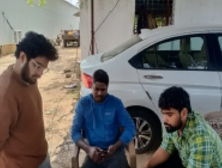 On-site Interview
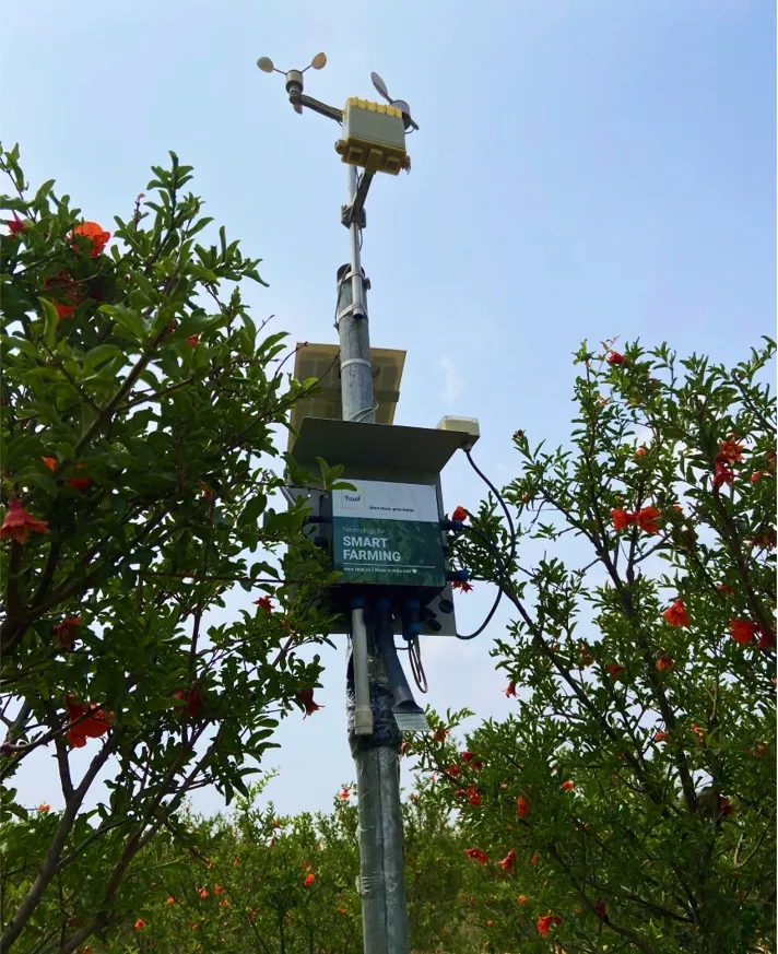 IoT Device in Field
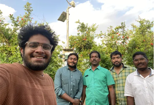 Selfie with FarmerOn-site InterviewIoT Device in FieldSelfie with Farmer
Internal Narrative
Stakeholder Feedback
Field Insights
Farmer Voice
15% of all support tickets were linked directly to confusion over sensor values or parameter meanings.
65% of surveyed users expressed negative sentiment regarding dial size and color density.
03Issues on Hand
Our research identified eight friction points that directly impact how farmers interact with and trust sensor data, ranging from immediate visual readability to deeper contextual understanding.
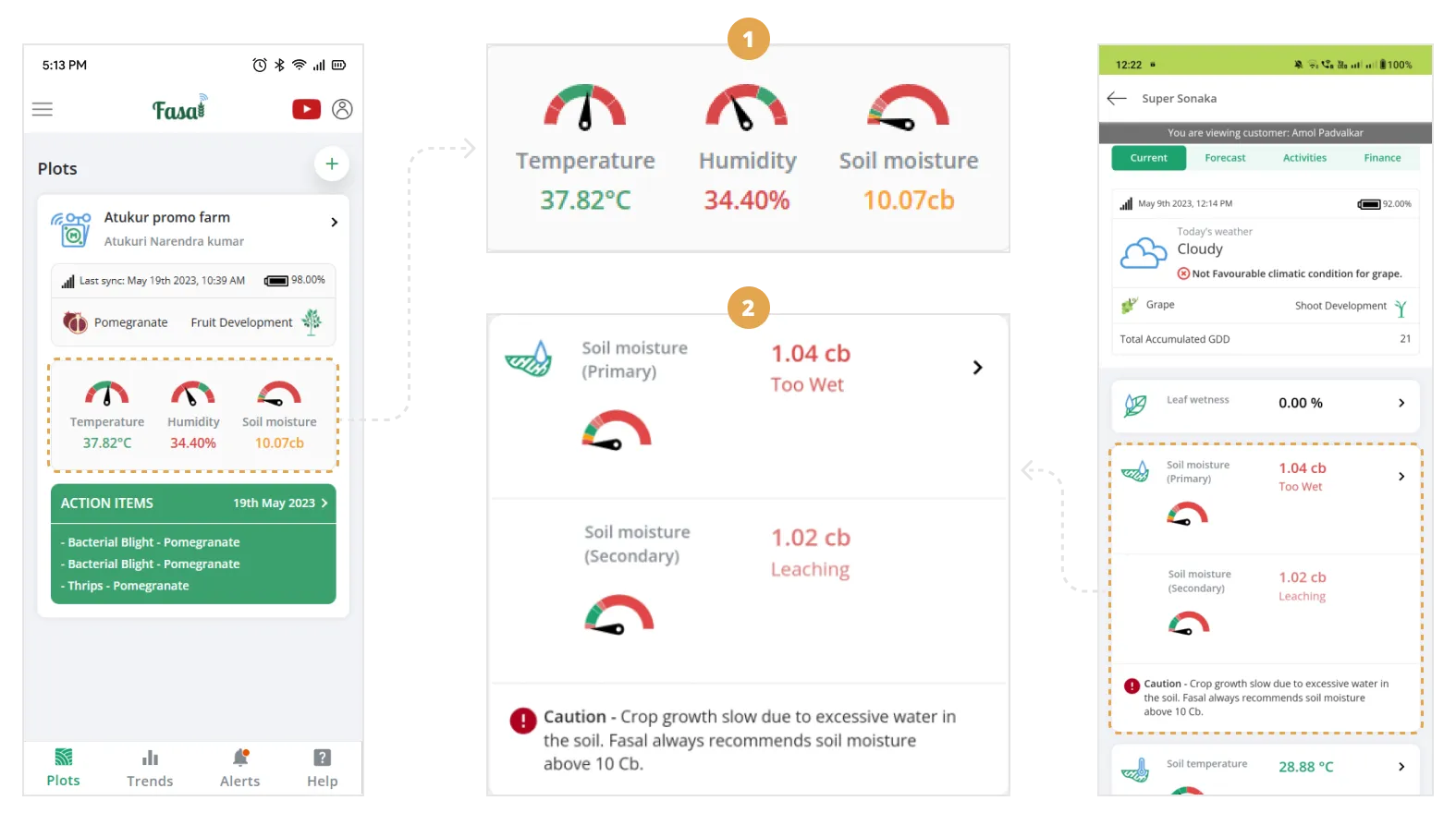
The original dial: five colors, tiny scale, nearly unreadable outdoors
- 01No data sync info: Farmers couldn't tell if they were looking at this morning's data or yesterday's.
- 02No contextual information: Farmers didn't know why each sensor mattered for their crop. Without that context, numbers were just numbers.
- 03Small dial size: The dials were too small to read clearly, especially outdoors in sunlight, on a small screen.
- 04Poor color scheme: Five colors crammed into a small arc made it nearly impossible for farmers, especially older ones, to know at a glance what was normal and what was not.
- 05Inconsistent placement: Dial positions varied screen to screen, making it hard for farmers to quickly locate and compare readings.
- 06No visual priority: Everything looks the same weight, so nothing stands out. Farmers can't spot what needs attention without reading every line.
- 07Inconsistent patterns: Buttons, labels, and layouts vary across screens, making the app harder to learn.
- 08Wasted space: The layout uses far more screen area than it needs, especially on small phones in the field.
04Goals & Constraints
Field visits made the priorities clear: readable for every farmer, regardless of age or tech comfort. The constraints were just as real: screen space, brand guidelines, and backend compatibility. Both shaped every decision.
GOAL
01Increased dial size
Larger dials, readable at arm's length outdoors, especially for farmers with visual impairments or lower tech literacy.
GOAL
02Improved color scheme
Reduce colors from 5 to 3, making it easier for farmers to know at a glance which reading needs attention.
GOAL
03Visual consistency
The redesigned dials should look and feel like they belong to the same app, not a late addition.
GOAL
04Reduced support load
Improving readability should directly reduce support tickets raised for sensor misinterpretation.
GOAL
05Prominent placement
Consistent positioning across all screens so farmers can find and compare readings at a glance.
GOAL
06Easy to learn without training
A first-time farmer should understand what they're looking at with no explanation needed.
CONSTRAINT
01While increasing the size of the dials was necessary, we had to balance this with maintaining an efficient use of screen space.
CONSTRAINT
02The color palette had to be carefully chosen to ensure accessibility while staying within brand guidelines.
CONSTRAINT
03Any changes to the sensor dials needed to be compatible with existing backend systems to avoid extensive redevelopment.
05Ideation & Design
We explored a range of dial designs, testing size, color systems, and outdoor readability, then narrowed to the strongest options for review with the Head of Product and Product Lead.
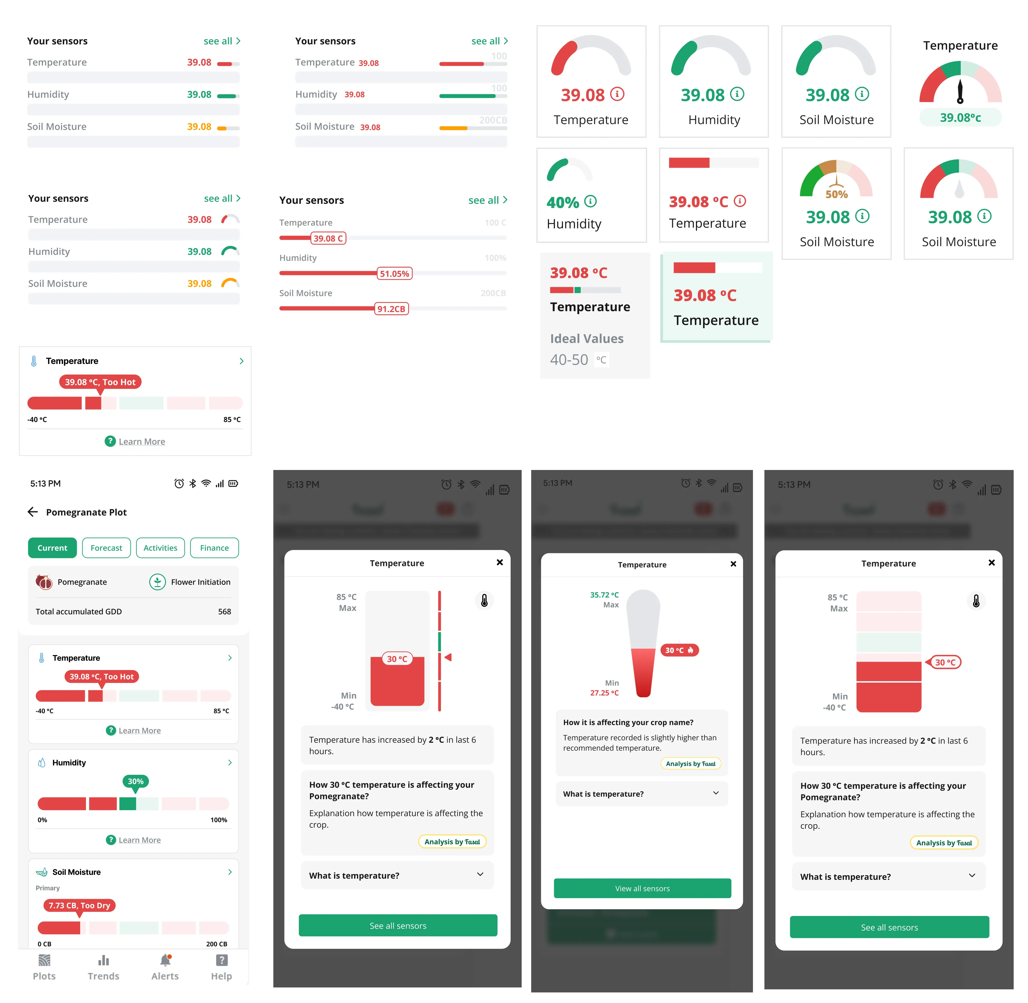
Exploring color differentiation and scale accessibility
06Final Design
We built two options: horizontal sensor bars (unfamiliar but potentially clearer) and improved dials (familiar, but redesigned). Testing both gave us a real answer, not an assumption, about which format made live sensor data feel readable and trustworthy for farmers in the field.
Design Options
Sensor Bars
- 01We redesigned the sensor display using horizontal bars instead of traditional dials.
- 02Designed to use screen space more efficiently and make readings clearer at a glance.
- 03We introduced a "Learn More" option for each sensor, providing detailed information on its importance for crop health and growth.
- 04Used clear color coding and visual cues to make readings instantly distinguishable.
- 05Large enough to read clearly outdoors, for farmers of all ages and tech comfort levels.
07Prototyping and User Testing
With both designs ready, we built interactive prototypes and ran a structured usability test in Useberry, watching farmers use the app live and tracking exactly where they hesitated.
GOAL
01Usability & Intuition
Find out if the new designs were genuinely easy to use
GOAL
02User Preference
Settle the bars-vs-dials question with real farmer input
GOAL
03Audio Effectiveness
Test whether bigger, clearer dials actually helped farmers read faster
GOAL
04Experience Feedback
Surface any confusion or friction before the design shipped
GOAL
05Problem Validation
Confirm we had actually solved the problems we set out to fix
08Key findings
User Preference Distribution
Dials Rationale
Farmers cited familiarity with analog machinery (tractors) and improved glanceability in bright sunlight as primary factors.
Bars Rationale
A small segment found vertical bars easier for comparing multiple sensor readings side-by-side during deep analysis.
- 01Familiarity builds confidence: Farmers recognized the dial immediately, comparing it to tractor gauges. The familiarity made the redesign feel trustworthy from the start.
- 02Bar design advantage: Farmers who preferred bars liked that the color indicator sat right next to the value, fewer steps to read.
- 03Overall ease of understanding: Farmers found both options easy to comprehend, with preference mainly based on visual appeal.
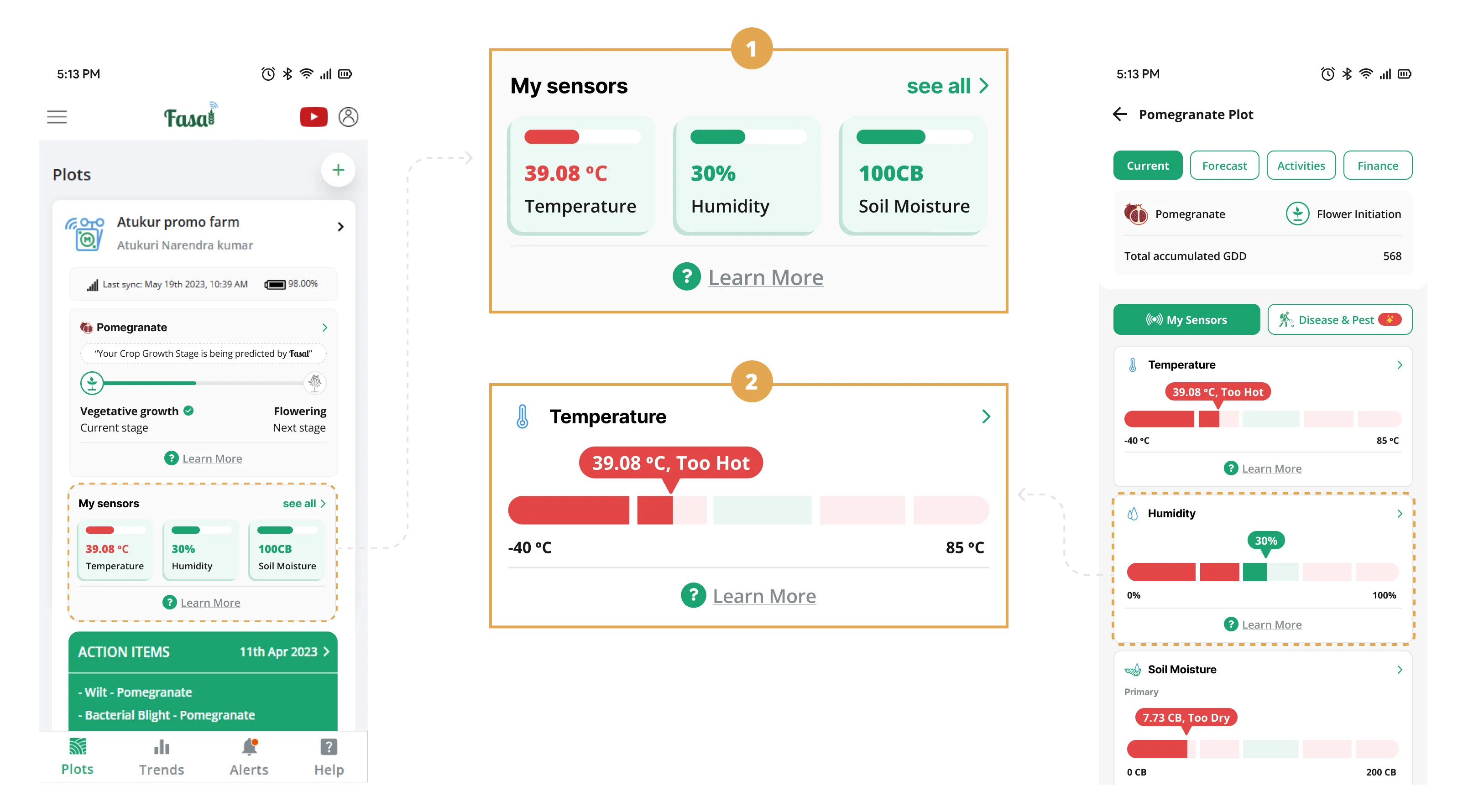
- 04The static problem: Farmers are used to watching dials move, like tractor gauges and speedometers. A still dial felt dead. We added a sweep animation on load so farmers could see the dial settle on its current reading, confirming the data was live.
09Feedback implementation
User testing pointed to clear improvements. First: a sweep animation on dial load, a visual cue that the reading is live, not static.
Sensor dial sweep animation demonstrating active monitoring
The result: sensor dials any farmer can read at a glance, outdoors, on a small screen, at any literacy level. Not just better-looking, but genuinely clearer.
10Impact
Easier to Read
Farmers said sensor readings were easier to understand, especially outdoors.
Fewer Support Tickets
Tickets dropped from 50 to 10 per week once farmers could read the dials themselves.
Contextual Help Used
Nearly 3 in 4 farmers explored the contextual help. They wanted to understand the data, not just see it.
11Way Forward
- 01Richer contextual help: Add short videos alongside text guides, formats that work across all literacy levels.
- 02Stay close to farmers: Schedule quarterly farm visits and in-app feedback cycles to catch new friction early.
- 03Track what matters: Monitor dial interaction time and support ticket themes to catch the next friction point before it grows.
- 04Iterate on evidence: Use field data, not assumptions, to drive the next round of improvements.